I have no clue what that phrase means, but I am using it for this post because I thought I might provide you with some pictures of some of the details, good and bad in the new house. It seemed that many of the pictures I took thus far were long shots. So this time, I got a little closer.
Here is a closer look at the cabinet doors in the kitchen. Well, one of them at least. It kind of loses its country baby blue effect that close up, but it is still that color. Do not fear.

This is a ventilation fan over the sink. It opens directly outside and is scary. It is also way high up and I can barely reach to turn it off. It looks cool though.
Here are two shelves in the kitchen. I originally thought they were spice racks because they are so narrow. However, they are not over the stove but across from it which makes them rather impractical. Since our pantry is so tiny (forgot to get a picture of that), I will probably store spices there anyhow. This weekend after B took one off the wall, we realized that there are grooves in there for plates - collector plates. GOOD LORD.
This is the light fixture in the kitchen by the window seat. It is pretty but doesn't really match the rest of the kitchen as it is (a) modern, and (b) has a purple rim around it. Since when does a mod purple light match country baby blue?
This is the chandelier in our dining room. It is is pretty and that decorative plaster at the top is pretty awesome. I was convinced this was plastic but am told it is glass. Not the biggest fan of brass though.
These are the little windows on either side of the dining room. I do not know why they put a little shutter on top of a big shutter since it is one big window, but there is a lot that is a mystery in this house. B would like wood slatted (?) shutters. I know what I am talking about, but not sure that is the right term.
This is some more decorative plaster on our living room ceiling:
Detail of the tile floor around the fireplace:
Detail of the brick around the fireplace:
More decorative plaster on the TV room ceiling:
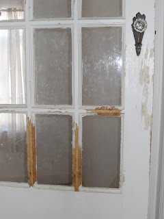
Remember when I told you the other side of the upstairs door was white and chewed up by a dog? I was not lying. Here is your proof:
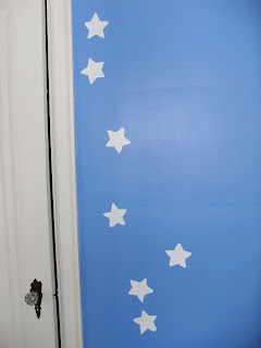
Close up of the blue with white stars painted room. Sassy!
And last, a close up of the tile in our bathroom. Yes it is still peach.
Next, we attempt to freshen the place up a bit...starting from the bottom up.*
*That totally sounded like something a newscaster would say at the end of a story. I feel so professional.


5 important things being said:
I'm so happy you finally have a place to display your plate collection!
That door almost looks white! Actually it does look white. Luckily I know better!
I don't know what I was thinking when I agreed and thought that was a spice rack. Of course it is to display plates! Everyone displays plates in there kitchen! NOT.
I like the fireplace!
From what I can see of it anyway.
i love the white stars on the wall, so creative and cute. and i love stars so of course i'd love it, haha.
Kacie - you know it is a dream come true!
Jenny - my spices fit in there quite neatly. I am going to foget it was ever a collector plate rack.
Matt - I will get you a better picture soon. Maybe even one with a fire in it.
Katelin - the stars are the least hideous thing in that room. And quite creative.
Post a Comment